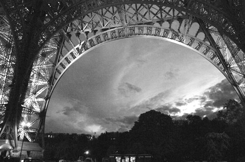
Eiffel Tower at night, 2005, Black and White
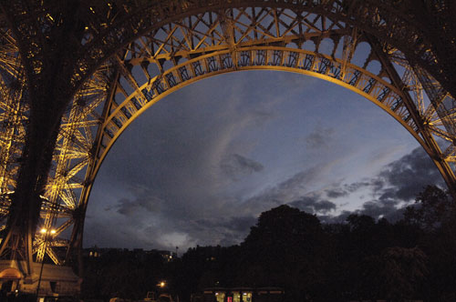
and in color…
We were talking the other day about the joy of black and white photography, and the next day I came across these two different versions of the same image. Also, Allison had her recent post on Paris so I thought this would be a good time to talk about these images. Now first off, there’s always the problem when you are getting an image of an iconic location or landmark. This can really be a handicap as you try not to make it look like those damn postcards that are staring back at you all over. If it weren’t for them jeering at you, you’d get a shot like this one below and god home be happy with it.
But here we are trying to get a different angle on it so I went for the two above. For me it was the black and white, but then looking at it again, I’m not so sure, perhaps the bit of color adds to it.
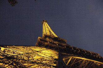
Speaking of angles here’s one more. Yes, we’ll have to get into a discussion of the power of angles to create very different views of the same subject. Remind me to go over that if I forget.
Oh, BTW these were shot with my Nikon D2X when it was still the hottest camera around, but you can see these all have a lot of noise that you wouldn’t see in the D3 series, but this was almost 6 years ago and there’s been a lot of advancement since then
In any case, let me know which image you like best and and why?
And tomorrow we should have a big surprise for you so stay tuned…
View Comments (9)
as i prefer black 'n white.. this one should be in color!.
I think that these shots are great in colour but if they were large black and white prints they would win hands down.
As it's already been mentioned here, B&W has the potential of punching up the dramatic factor. Because of the history of photography, it also automatically adds a nostalgic element.
Obviously both color and b&w have their strengths, but definitely something very cool and powerful about b&w that allows it to still be so popular regardless of all the technological advances in photography.
Thanks Kevin, I agree
I prefer the B/W. It just seems a little more dramatic. And how many "postcards" do you see in B/W? So the B/W is more unique as well as being more dramatic.
yes good point Greg, nothing like seeing the prints.
On the web page color gets the edge, but experience tells me it might be different results larger or on paper.
I like the b&w...much more dramatic!
Color looks better to me.
Erez.