The Strongest Way of Seeing
Article by Huntington Witherill
“Consulting the rules of composition before taking a photograph is like consulting the laws of gravity before going for a walk.” — Edward Weston
When it comes to the art of creating successful photographs, formulating an effective composition must surely be at (or near) the top of the list in terms of relative importance. As it turns out, where you point your camera is a substantial part of achieving any successful photograph. (I know… that seems fairly obvious, doesn’t it?)
As it also turns out, knowing where best to point your camera requires a skill set whose precepts appear to be instinctively derived, rather than intellectually prescribed. What might work in one situation can often prove disastrous in another. As such, employing a formulaic approach to composition will, more often than not, prove ineffectual.
Weston’s quote (above) seems to imply that consciously following a set of compositional rules will make little sense because the rules themselves – immutable as they may or may not be – do not necessarily dictate the quality of result. Knowing how and why gravity works as it does will probably not help you to determine the best direction to proceed as you begin to walk (unless of course you find yourself standing at the edge of a cliff).
So, the question becomes… How does one determine the most optimal composition each time they are presented with a particular scene they’d like to photograph? Unfortunately, the most helpful answers to that question will nearly always include the admonition that one simply cannot predetermine the best direction to follow because successful composition is, in large part, a matter of instinct and intuition.
Edward Weston has also noted that “Composition is the strongest way of seeing.” Concisely summed up in those seven words is not only a succinct description of what the art of photographic composition truly is, but also – given his specific use of the word strongest – the implication that there is but a single best solution available for each unique photographic situation.
Well that seems simple enough. All we need do is find the single best composition inherent within each individual photographic scene, press the shutter release… and then wait for the exhibition offers to start rolling in. (Doesn’t the camera do the rest of the work?) Right. And wouldn’t it be nice if the process was that simple?
Obviously there is more to photographic composition than precise aim, alone. The specific quality of light under which each scene is photographed will also contribute (significantly) to the overall success or failure of the resulting composition. In short, quality of light is every bit as important as one’s chosen point of view. Don’t forget, we’re recording light and not simply cataloging an array of physical objects.
Admittedly, there are any number of oft-prescribed compositional rules that one might consider (i.e.- the rule of thirds, the golden mean, leading lines, symmetry, asymmetry, positive/negative space, and so on) to serve as rough guidelines in helping to formulate a potentially successful composition. Yet, as is the case with most every rule associated with photography, none of those prescribed rules will work in all instances. To again borrow from Weston: “Following rules of composition can only lead to a tedious repetition of pictorial clichés.”
While there are, indeed, some relatively pragmatic ways to approach the art of composition (and I hope to explore a couple of those potential strategies, herein) in practice, achieving the most effective composition is simply not going to be the kind of problem that can be resolved through wrote memory, or a prefabricated list of instructions. It is a puzzle that must be resolved through visual perception, spatial instincts, situational awareness, and emotional intuition. And as an aside, it is this very conundrum that actually provides one of the most enjoyable and satisfying puzzles that photography has to offer.
Though there are no steadfast rules applicable to the act of creating a successful composition, there are a couple of working strategies that I’ve found to be quite helpful in identifying and resolving some of the issues related to initially establishing the most advantages viewpoint from which to formulate an effective composition.
The first strategy is fairly easy to implement and is best described as follows: Squint your eyes at the scene until you are no longer able to see all of the minute details inherent in the scene, itself. What this will do is then allow you to view the scene as a more simplified array of basic geometric shapes and spatial relationships that can more easily be arranged and resolved (through strategic camera placement and specific lens choice) in order to more quickly and accurately establish the optimal point of view from which to further refine your composition.
The second strategy is a bit more involved but, in my opinion, well worth the extra effort. The strategy, itself, centers upon keeping in mind that the human eye is able to focus only a relatively narrow field of view at any given point in time. To illustrate what I mean, I invite you to hold out your hand at arm’s length (as though you are directing someone to “Stop!” in front of you). With your arm outstretched, spread your fingers apart, close one eye, and with the other eye, focus specifically on your thumbnail. What you will immediately notice is that, while your thumbnail remains in sharp focus, the rest of your fingers will be completely out of focus. What this tells you is that the eye is capable of accommodating only a relatively narrow field of precise focus at any given time. As such, we are normally unable to view photographs (or much of anything else for that matter) with a single fixed glance (as the camera is so uniquely able to do). Our eyes tend to continuously scan around and throughout the overall scene – while the brain endeavors to store those bits and pieces of gathered visual information – and it is the brain that then assembles that information to inform us about the collective nature of the overall scene, itself. And of course, the entire process happens so quickly that we normally don’t pay much attention to what’s actually occurring.
In practice, the above described narrow field focus limitation can be used as an effective means to help direct the eye throughout its visual journey (the actual scanning process) that occurs when one is viewing a photograph. By how and where you place and arrange objects within the photographic frame, you can essentially help to encourage (to orchestrate) a more deliberate and focused path for the human eye to follow during its journey to gather information about the photograph, itself. As but one rather simplistic (though clearly not invariable) demonstration of this phenomenon, you may have noticed that the eye will often tend to be initially attracted to the brightest objects in the frame, prior to being attracted to darker areas within the overall scene. In short, the technique, here, is to pay close attention to the actual journey that your eye takes as it is initially gathering visual information about the scene you intend to photograph. By doing so, your composition can then be adjusted to encourage a more strategically mapped-out path for the eye to follow, so that the viewer is then forced to see (to pay greater visual attention to) whatever it is that you actually want the viewer to see and perceive.
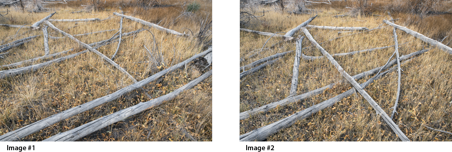
Admittedly, the act of orchestrating a prescribed visual journey for the eye to follow might seem a bit esoteric. With your indulgence, allow me to offer a couple of photographic examples to help explain what I mean. Consider the following two photographs:
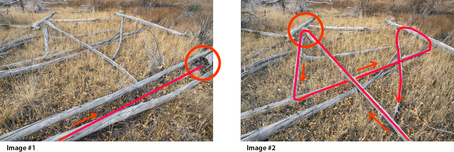
You may note that the image on the left (Image #1) tends to initially draw the eye into the frame at or near the lower left corner of the frame, itself. The eye will then have a tendency to travel diagonally, up and to the right, following the line of the foreground logs until they terminate at the center right-hand edge of the overall composition. So far… everything seems OK. However, the moment the eye arrives at the right-hand edge of the composition, it will immediately notice (and then fixate upon) a rather prominent, fragmented, and visually discordant tree stump located at the extreme right edge of the frame. Unfortunately, it is at this specific point that the composition – and therefore the photograph, itself – has ultimately failed. The severed tree stump not only appears to be contextually inharmonious (by comparison to the rest of the scene) its placement at the extreme edge of the frame causes it to attract a significant amount of unwanted visual attention. Once you notice the stump, your eye will continue to be drawn to it, and it will then become the unintended focal point of the overall composition. With this particular image, it is of course the unique arrangement of fallen trees (and not the errant tree stump) to which I am hoping to draw your attention.
Now let’s consider the image on the right (Image #2). In this instance I have moved the camera several paces forward and a bit to the left so that I am able to achieve a composition of similar visual structure (to that shown in Image #1) while, at the same time, effectively bypassing the errant stump problem, altogether. You may note that Image #2 contains (essentially) the same information as is contained in the top half of Image #1. By the way, at this point neither image has been cropped or otherwise altered in terms of its original content.
With Image #2, the eye will tend to enter the scene toward the lower right of the frame and it will then follow the line of that longer receding log, up and to the left, until it arrives at the intersection of the short (perpendicularly situated) log which is serving (together with a couple of other logs converging at that same approximate point) as the intended focal point of the composition, itself. Once the eye has reached the focal point, it will then tend to continue its journey along a path that is, more or less, similar to that illustrated in the diagram, below.
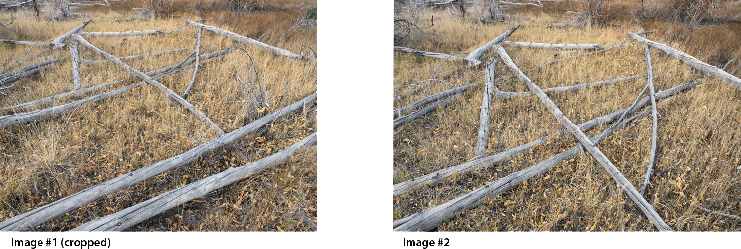
At this stage, having concluded that Image #2 clearly displays a stronger composition than does Image #1, the job is now complete, right? Well… not exactly. There are of course a variety of post processing strategies which could be brought to bear in order to mitigate the problem associated with Image #1. As but one example, I could simply crop off the entire right-hand edge of the frame in Image #1 (as shown below) thereby effectively removing the unwanted stump. And in so doing, I would then be faced with a considerably tougher decision about which composition might, at that point, be the stronger of the two. While I continue to favor Image #2, the decision is not quite as clear-cut as it was prior to the act of cropping Image #1. Suffice it to say that each implemented change will precipitate new and different considerations to be taken into account.
Now at this point you might ask… what was the final outcome in terms of how I eventually determined the most effective composition to settle upon? What actually happened in this case is that I ended up going with an entirely different image (taken in the same area, during the same shooting session) which I continue to feel more effectively portrays the choreographed nature of random patterns associated with the array of fallen trees. After all, it was those attributes that had attracted me to the area in the first place. In my opinion, the final chosen image (displayed below and titled: Fallen Trees, Great Sand Dunes National Park, CO, 2016) not only celebrates the unique and random character of the fallen trees, it also conveys a better sense of the overall environment (the surroundings) within which the trees, themselves, were situated. And frankly – and certainly not inconsequentially – the specific quality of light (which of course was constantly changing as I continued to photograph) is considerably more dynamic in the final chosen image. In the end, the choice seemed clear and unequivocal. The quality of light in the final image helps to enhance the composition by conveying a greater sense of depth and dimension, thereby resulting in a more visually and emotionally compelling result than might otherwise have been the case with either of the two initially considered images.
The ultimate question… Does my final chosen composition represent the “strongest way of seeing”? Fortunately for me, that is a decision that is normally made by the viewer, not the photographer. So in that respect, I’m afraid you’re on your own.
When it comes to sure-fire strategies for achieving consistently compelling compositions, there is really no substitute for extensive first-hand experience. The more you practice composition – not only by exercising your own camera, but also by intently studying the specific compositional elements that have been used (by others) to resolve those photographs that you find compelling – the better equipped you will be to develop greater sensitivity to spatial relationships, tonal arrays, color distribution, visual balance, contextual awareness, and a host of other intuitive practices that go along with successful composition.
For me, personally, formulating and resolving photographic compositions has always been the most enjoyable aspect of producing photographs. I love a good puzzle and every photographic situation provides a new and challenging puzzle to solve. I don’t always get all of the pieces in the right places (and frankly, some have occasionally suggested that I might even be missing a few pieces) but hey… that’s a discussion for another day.
If you would like to find more about Huntington Witherill, you can find more of his work on his website or watch our recent video where he discussed 3 secrets to taking eye catching photos.





Leave A Comment
You must be logged in to post a comment.