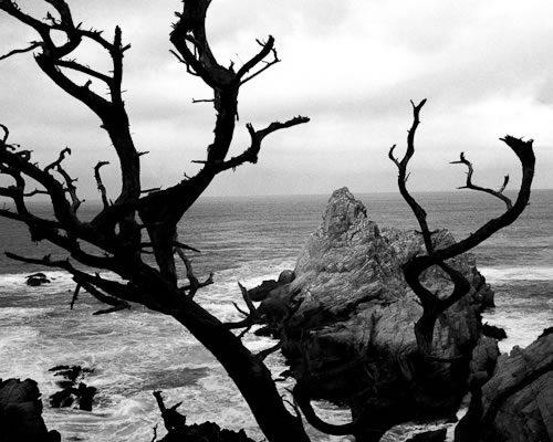
Point Lobos, CA about 1965
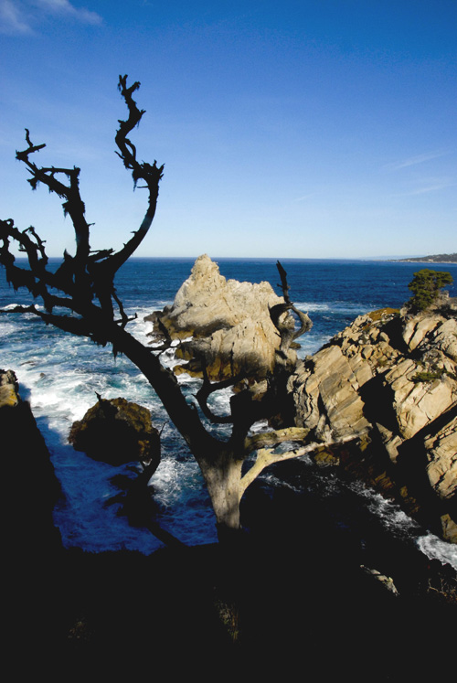
Point Lobos, CA 2011
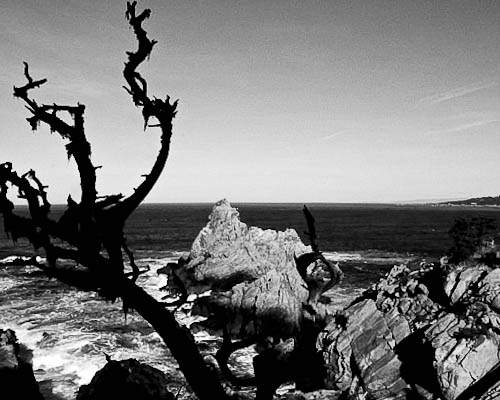
New 2011 Black & White Point Lobos
Which image do you prefer? I’d really like to know and why? But make up your mind before reading this.
They were shot decades apart under completely different conditions and circumstances: The top was taken on my Plaubel Makina, a medium format camera that I had just gotten for Christmas and loved dearly. My family was vacationing in Carmel and we were walking out on Point Lobos, the very place where Edward Weston lived near, and frequented with his students and famously with his model Charis Wilson. He called it the “lumber yard” for his creativity. But at the time I pressed the shutter I had not seen Weston’s own photo from this same spot. Right after I made this picture man a walked by and informed me, “that’s Weston’s photo”, for a moment I felt accused like I had “taken” his photo and plagiarized it. That feeling passed when I realized, it was mine and from my point of view, it was my image damn it, not Westons! I took the film home and developed it in our laundry room turned darkroom. Decades later I scanned it, and now you see its digital version.
The bottom one was taken last Sunday out on a walk with friends, which the camera (Nikon D200) was borrowed from. I was not being a “serious” photographer, rather enjoying the walk and getting a few images along the way. When I came to this point of my previous image, of course I had to get it. The branch has taken a beating over the years, and I didn’t have the advantage of the dark and moody sky that I had in 1965. And this time processing was not done in my darkroom, in fact I used Lightroom!
After reading your comments I went back to the darkroom, er, PhotoShop and worked on it again. This is a great way to do an online workshop, we should do that!
View Comments (21)
The first image is the most pleasing of the group for me. The branch on the right side of the shot is more pronounced in the first image. Letting us see the twisting of the branches.
I like the 1965 best; it really communicates the austere nature of Point Lobos. I spent many a year there; had an aunt who lived in Carmel in the 50's and 60's plus my Sister lived there in the 70's and 80's. The '65 shot really captures the wind and the sea two dominant themes of Lobos
The colored shot would be next followed by the 2011 Black & White.
Ta Ta!
Definitely the first one. No hesitation.
i do like the images but i do prefer the top ones.
look at these photos on my website.
http://ohsnapppp.weebly.com/index.html
you're right it's right where I wanted it in the top image
To the truth, I really don't care for any on them. I think the tree is too much "in your face." In the last image it becomes a distraction. Sorry
I really like the framing of the older version. Although I usually like color, black and white suites the mood of this better.
I very much like the first one and my wife does also. I do not like the shading as much in the newest photo and the color is not even in the contest
First one for sure. More interesting sky, and the more imposing tree are what do it for me. The only thing the second (and third) shot has that I like better is the level horizon.
A blue sky always leaves such a vacant space, doesn't it? The first image has a better balance between sky, mid and foreground and the clouds contribute to composition